
The House of the Circular Terraces is part of a garden designed for the enjoyment of the Atlantic Forest. Located in a valley, the property does not offer particularly striking views from the horizon. Instead, the focus point within this landscape is composed by the space defined by the canopies of the trees. In order to work with the terrain’s natural slope and existing clearings, intermediate-level terraces were established. The house itself is organized on these plateaus, with communal spaces placed near the entrance, closer to the street, and private rooms located farther at the property line, as depicted in its longitudinal section. While the roof is designed as a continual and leveled line in the horizon, the floor surfaces conform to different layers at the ground, which configure a series dynamic spaces with varied ceiling heights. A suspended balcony covers the garage, and at the other end of the house, this space is mirrored at the bedrooms, conforming a layout in which the built space echoes the geography of the valley. The house’s geometry is orthogonal, compatible with its prefabricated wooden structure. The garden’s curvilinear geometry is seeking the best structural form for building retaining walls while at the same time promoting proper integration with the existing trees. All rooms have at least two entrances, reaffirming the idea of a circular path for users. The formal containment of the house contrasts with the dynamic profile of the circular terraces, suggesting a reversal of the traditional subservient relationship between the base and the building.
Archives: Projetos
Sítio Rio Acima

The renovation of Sítio Rio Acima was conceived as a series of punctual interventions that when stitched together, complement each other creating a sense of unity. The sítio has been used for over forty years by different generations of the same family. The first challenge of the project was to deal with the pre-existing conditions of the site – the site’s complex had very disparate constructions, made in different periods of time, and all of them carried sentimental value to the clients. Situated on the outskirts of the city of Jundiaí, the Sítio’s constructions also allude to its neighborhood’s particular landscape, combining aspects of the rural countryside with remnant sheds and chimneys that represent symbols of the city’s not-so-recent industrialization.
The new buildings used solid brick masonry, a material that was absent on the site, and thus, served to emphasize the new interventions. This choice of materiality is inspired by the abundant brick kilns of the surrounding area. The brick also bears the mark of the arrival of the first factories and railway structures in the city, such as the crooked bridge (ponte torta).
The main entrance of the Sítio is located at the lower portion of the site, where an access road runs alongside a small lake and is delimited by a curved cyclopean concrete retaining wall. This containment wall is an element that both determines a designated garage space, and also supports the caretaker’s house’s landing platform. The caretaker’s house (casa do caseiro) alludes to the Brazilian “caipira” architecture, a vernacular type of construction from the countryside that can still be found in other houses within the sítio’s neighborhood. One example of this construction style is the casa do caseiro’s shaded porch contained between two blind volumes, which is also referencing old bandeirista colonial houses.
Continuing further on the same access road, the sítio’s main house is located on the higher slope area to the right. Looking down to the left, near the lake there is a swimming pool, a kiosk, and a new volume dedicated to the bathroom and changing rooms built with brick spiral walls. The new construction by the pool was placed in opposition to the existing kiosk, at the vertex of a triangle that combines all three elements.
The main house is a remodeled version of the existing wooden cottage, which originally had three bedrooms and two bathrooms. The bathroom of the old master bedroom was demolished, and the space was rearranged in order to accommodate a fourth bedroom within the old structure of the house. Two new bathrooms were allocated into an annex at the back, outside the main house. All bedroom windows were replaced by french doors with shutters, extending the space of the rooms to the veranda outside, covered by a wooden pergola structure.
The living area was redesigned to accommodate more guests, an adaption that suited the current usage and needs of the house. The kitchen and dining room were redistributed within the social areas of the existing cottage structure, and a new addition was made to lodge space for a more generous living room: a cubical volume with a vaulted ceiling. Looking from the outside, the new living room volume aligns with the roof ridge and at the same time is also leveled with the existing eaves, unfolding into the concrete structures that protect the wooden frames.
The spatiality of this house is inspired by its roof’s unusual profile, where the old orthogonal structure of the cottage meets with the new ceramic vault of the living room volume. The sunlight reverberates from the top vaulted windows across the living and dining areas. Just outside on the deck, there is a hot tub delicately placed between two gigantic indaiá palm trees, looking out at the lake and the pool.
Half-slope house
Built upon the retaining wall which sections a hill slope, this house’s geometry manifests the encounter between the natural rise of the terrain and a manmade plateau. Above all, the construction lies in the intersection of natural terrain and human habitat. Located in the outskirts of São Francisco Xavier, a small village in the countryside of the State of São Paulo, Brazil, the lot is a steep terrain, as it is part of the mountain ridge that comprises Serra da Mantiqueira. The lot had a plateau from a preexisting construction, later demolished to give room for the new house. One of the challenges of the project was to find the means to integrate the plateau in favor of the new house. A customary solution would be to erect it entirely on the existing levelled ground, contained to the pre-existing perimeter. But this would hinder all space available for outdoor activities, and when it comes to a country home, outdoor leisure areas are as important as the indoors.
The solution was to build it half-slope.Placing the rooms and bathrooms on an upper level within the ascending slope whilst reserving only part of the plateau for the ground-levelled living room and kitchen assures most of the flat portion of the land is dedicated to outdoor leisure usage. A large sliding door allows the dining table to be moved outside for an open-air lunch or picnic, which further expands the possibilities of social activities to the outdoors.
Three bedrooms and bathrooms occupy the upper floor, which is enclosed by the slanted terrain. In contrast to the open space communal areas, the bedrooms are small, encased spaces. They also have their own access to the outdoors, so a visitor can step directly outside his room and feel the grass beneath his feet without having to cross the entire house.
There is intent in the design to create diverse spacial sensations, which differ from what one usually experiences in everyday life in a city apartment. The built topography results in different heights and a myriad of pathways throughout the space. There’s a game of scale noticeable at first contact: the elevated mid plateau which gives access to the elevated bedrooms, adjacent to the retaining wall, makes the construction seem smaller and lower than it is in fact. This perception of scale shifts as one roams along the length of the main wall.
The angle of the roof refers to that of the terrain, in profile similar to the original landscape. Opposed to this gentle gesture, the retaining wall is the strongest expression of the projects intentions. Its length is almost three times that of the house itself, as it stretches out of the enclosed space, expanding different levels and providing different uses to the outside.
The flight of stairs, which binds the main wall to uppermost, is mirrored outside the house. Here, the glass doors, observable when one descends the stairs, evoke a mixed state of reflection and transparency. In this play of see-through and reflection, the interior presents itself as a mere segment – occasionally covered – of a much-extended construction.
In its essence, the project revolves around the act of building a house merged with its site; not as a mimic of nature, but as something that feels deeply rooted in its righteous place.
press
Manual of Biogenic House Sections – Oro Editions (set 2022)
The Sunny Side of Life – Braun Publishing (out 2017)
住宅美學Living & Design月刊 – taipei (set 2016)
revista gree – china (março 2016)
estadão – caderno casa (julho 2016)
programa televisivo estilo – arte 1 (junho 2016)
casa e jardim (maio 2016)
galeria da arquitetura (fevereiro 2016)
portal vitruvius (fevereiro 2016)
revista arquitetura & construção (dezembro 2015)
revista projeto design 428 (dezembro 2015)
dezeen magazine (dezembro 2015)
site archdaily internacional (dezembro 2015)
site architizer (dezembro 2015)
casa vogue brasil (dezembro 2015)
awards
prêmio AkzoNobel/TomieOhtake 2016
top 100 projetos brasileiros -archdaily- junho 2016
seleção de 15 obras brasileiras para a X BIAU
prêmio ebramem/WWF de Arquitetura em Madeira
Docol Revestir 2026
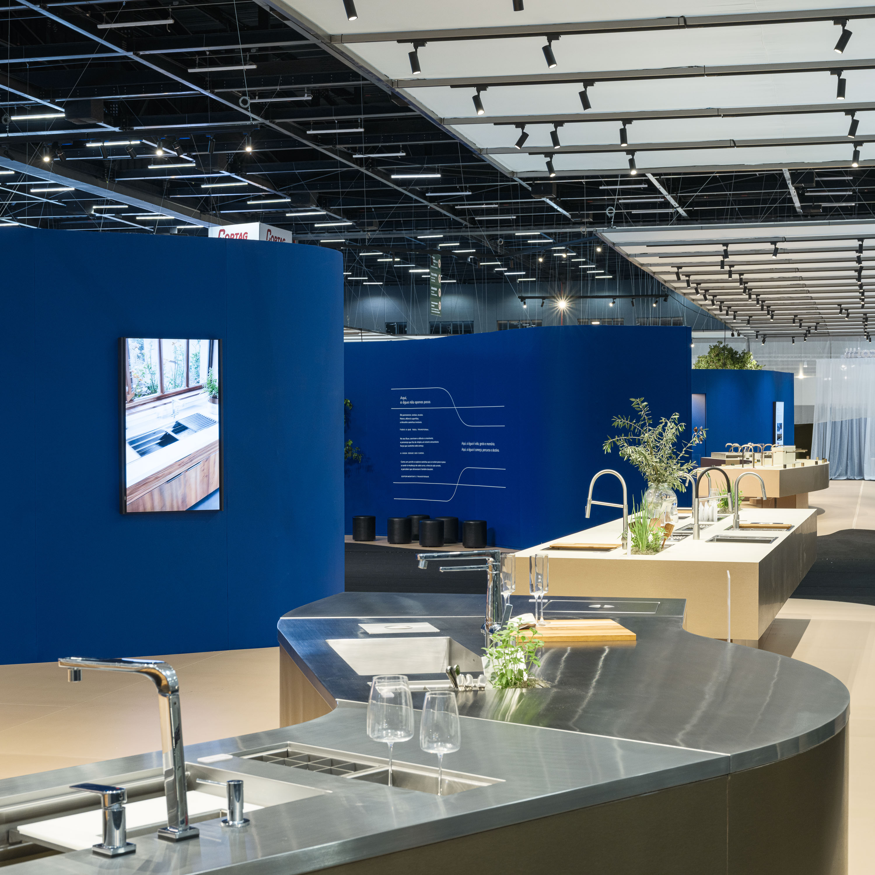
“Designing for temporary environments such as trade fairs presents a unique architectural challenge. Detached from a fixed context, these spaces must create their own identity while responding to intense flows of people, artificial lighting, and highly controlled conditions. In this setting, architecture becomes both a visual attractor and an experiential device, capable of guiding movement, framing perception, and constructing atmosphere within a limited timeframe.
At Expo Revestir 2026, the stand developed for Docol by Denis Joelsons embraces this challenge through a concept rooted in water. Without a conventional surrounding to respond to, the project redefines context by engaging with the conditions of the exhibition pavilion itself, a space characterized by a dark ceiling, homogeneous lighting, and continuous movement.
“Usually, I design starting from the surroundings,” the architect explains. “Here, the context is the pavilion itself, which creates completely new conditions.” From this abstraction emerges a fluid spatial strategy, where form becomes the primary driver of experience.
The layout unfolds as a sinuous composition inspired by the image of a river, a reference that connects both to the theme of water and to the origins of the brand in Jaraguá do Sul, a region marked by winding waterways. This gesture is reinforced through the use of blue tones and soft, suspended elements that evoke clouds, evaporation, and the different states of water.
Beyond its symbolic dimension, the project is carefully structured to respond to the dynamics of the fair. Circulation is clearly defined, guiding visitors through distinct zones while separating the interior experience from the surrounding visual noise. Each area is shaped by a specific formal language, from expansive display surfaces to more intimate spaces dedicated to wellness, conceived as an embracing geometry that encourages pause and interaction.
The stand also explores the expressive potential of temporary architecture. Freed from many of the constraints of permanent construction, the design experiments with exaggerated curves and continuous surfaces that organize both open and enclosed functions. These elements act as a backdrop, creating a sense of cohesion while allowing different product narratives to emerge.
The project constructs a spatial narrative where water is translated into movement, atmosphere, and form. In doing so, it transforms a transient structure into a memorable architectural experience that engages visitors beyond the visual, inviting them to navigate, pause, and immerse themselves within its flowing geometry.”
from the article by Daniela Moreira da Silva on Architecture Hunter
Leda Catunda’s Studio
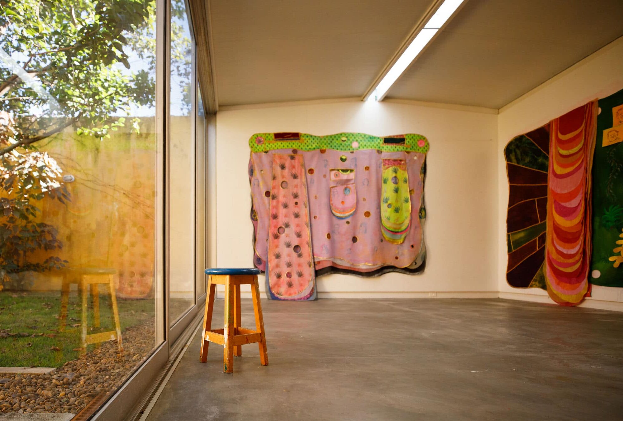
Leda Catunda is producing works on a new scale, with dimensions in frank dialogue with the size of the museum and gallery spaces where she exhibits worldwide. The limitation of the environments in the house that the artist transformed into her studio became pronounced with the stature of the new works. This limitation led to the invitation to imagine together an annex where it is possible to work with natural light, hang larger works, work on walls, floors, or suspended easels. Two longitudinal profiles ‘bite’ the pre-existing concrete beam and shape the skylight of the annex. A ridge that diffuses light into the space. I designed a kind of rack supported on carts on the lower flange of the metal profiles, for the creation and appreciation of the different faces of her suspended pieces.
The walls are the main working surface in the studio. In order to make the fixation of canvases, fabrics, and papers easy and low-maintenance, we covered them with white-painted plywood. Just imagine the damage everyday nails would cause if the wall were left with a plaster finish. To keep the walls unobstructed, all outlets were positioned at the baseboard height, in the gap between the plywood surface and the burnished cement floor. Finally, a reinforced mortar cabinet with only 4cm thickness houses the sink, paint, and brushes.
costa esmeralda houses
The main virtue of this residential development on the Santa Catarina coast is that the back of every lot opens up to interesting views. The five examples presented here illustrate an occupation strategy:
Courtyard houses oriented toward their own gardens, providing privacy while preserving the horizon.
Single-story houses respect the slope of the hillside, allowing the uneven terrain to be accommodated at the entrance and at the rear.
A linear layout ensures that all houses have excellent solar orientation toward the north or east.
Pools occupy the rear slope of the lot. The water’s surface creates a delicate boundary for the courtyard and mirrors the horizon.
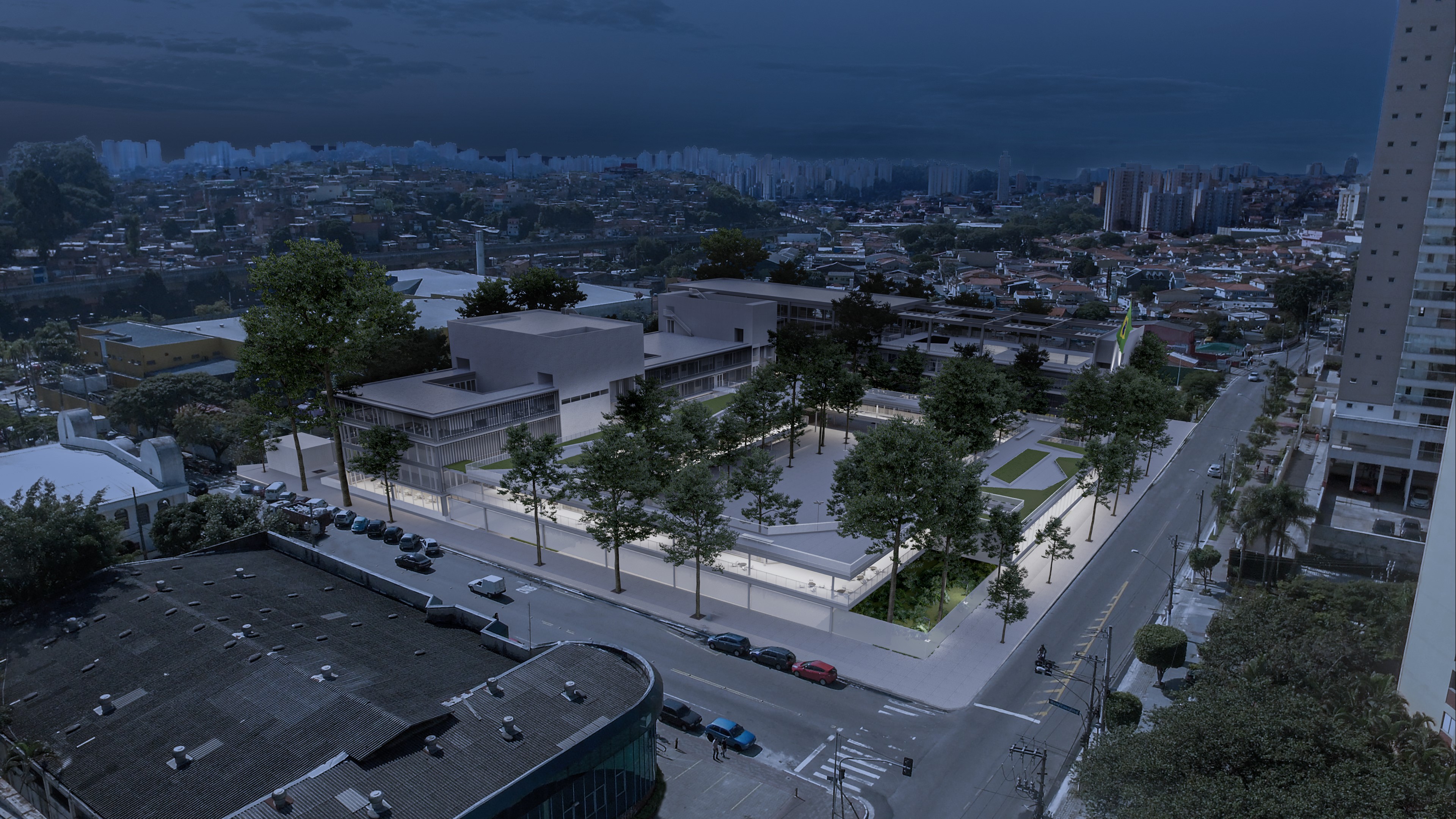
Sesc Mogi das Cruzes
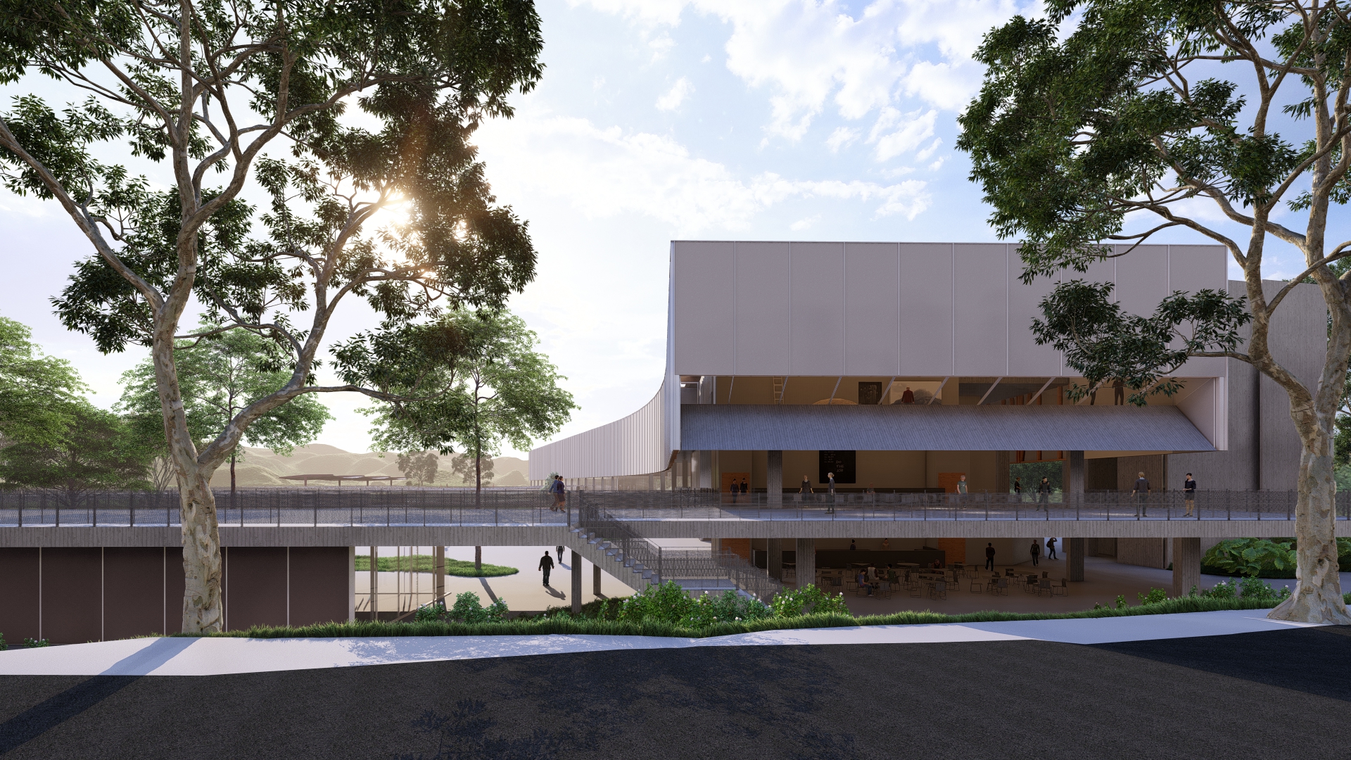
The new Sesc Mogi das Cruzes unit will function as a park-like facility nestled between a tree-lined avenue to the south and the Itapeti mountain range to the north.
The scale of the site and the geography of the valley allow activities to unfold both within the building and throughout the landscaped gardens. The adopted architectural approach takes full advantage of the extensive interface between green spaces and built structures. A broad esplanade runs along the perimeter of the site, bridging the elevation difference between the main access road and the park’s grade. The park takes on the character of a courtyard or campus, sheltered from highway noise. The main building, positioned along the eastern boundary, frames the view of the Itapeti mountains. Extending 200 meters, the curved pavilion reflects the monumental scale of the range, which is typically absent from the urban landscape. At Sesc Mogi das Cruzes, the architecture becomes a backdrop that highlights the park itself.
Access from the esplanade adjoining the highway continues the sidewalk level from the corner of Rogério Tacola Street to the first floor of the main building. An ice cream shop/café activates the foyer of the performance hall, which can remain open at night with independent access from the rest of the facility. A large guillotine-style door allows the performance hall to function as a stage and scenic box for open-air events. The park is enriched by surrounding verandas and is structured by an alley that organizes the garden into a sports zone to the north and a cultural/educational area to the south. A small hill in the courtyard of the cultural sector offers a vantage point for latecomers to outdoor events and provides shelter for the children’s play area and the library.
The curvature of the pavilion building results from the parallel alignment of its ends with the streets that border the site. This inflection embraces the park and creates a service courtyard to the west, where loading docks and service towers are located. The subtle arching of the structure makes its full length perceptible to visitors. The building’s floors can be constructed using concrete slabs with reusable formwork, and its envelope made from off-the-shelf insulated panels supported by a lightweight timber structure.
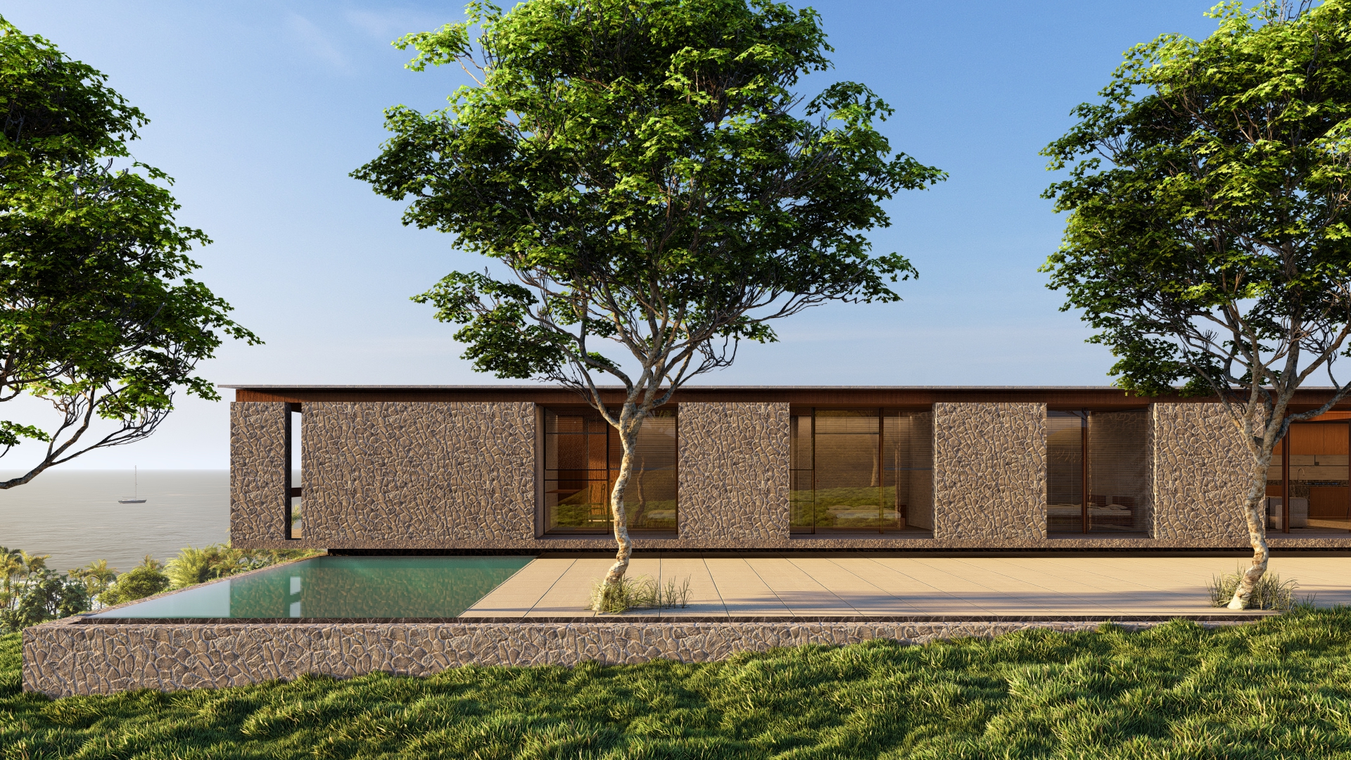
House in Guararema
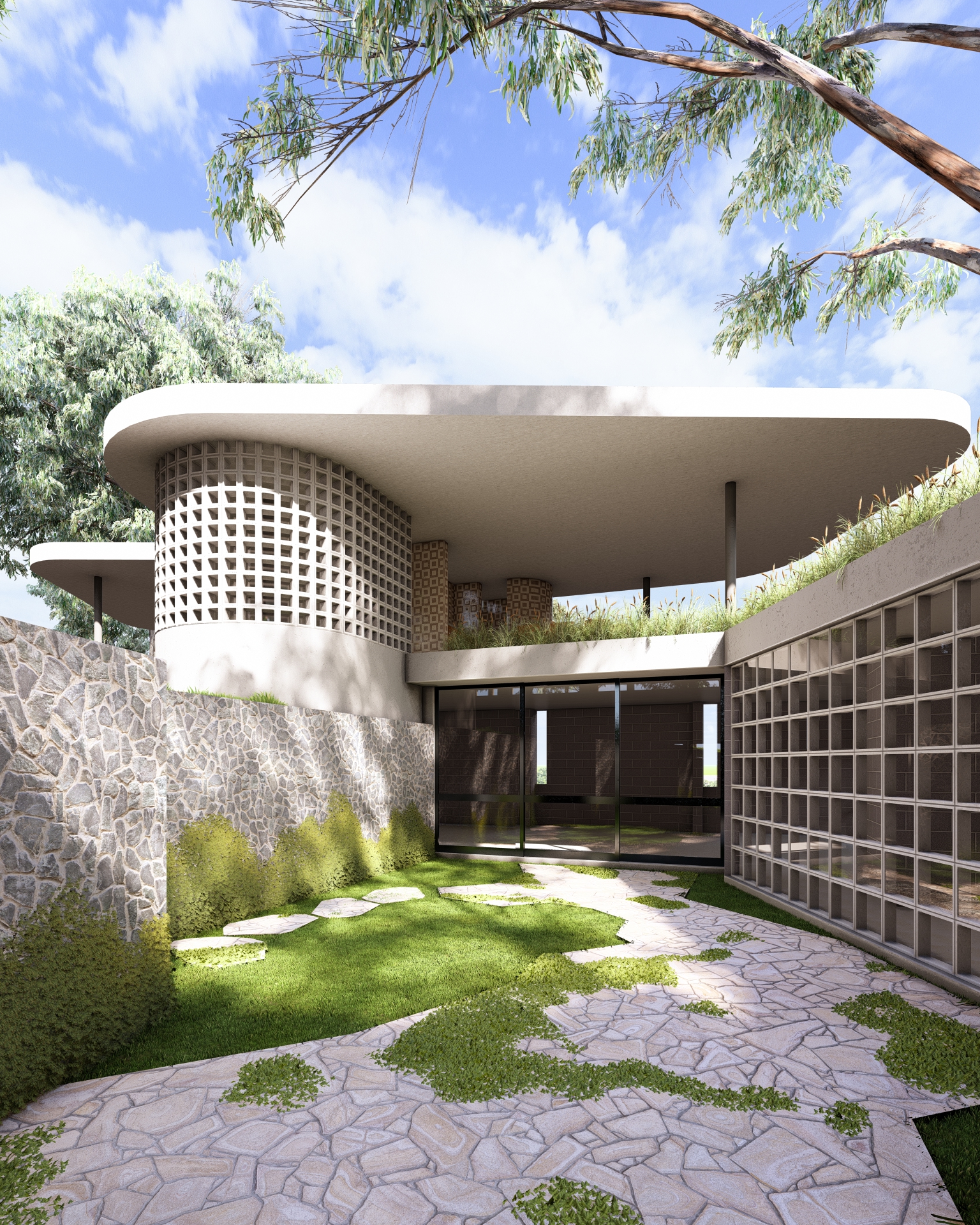
The triangular geometry of the plot, combined with its sloping topography, posed an interesting challenge for the design of this residence—particularly due to the inclusion of a lap pool in the program. Access to the house is marked by a sinuous canopy that integrates the garage, staircase and a leisure area, providing shaded continuity to the solarium and pool. The curves of the walls and the canopy above the solarium contrast with the constructive rationality of the house, expressed through the use of prefabricated elements such as exposed concrete blocks, cobogós, and a helical staircase.
The living spaces and bedrooms are oriented toward the privileged view of the rolling hills that define the mountainous landscape of Guararema. The best view, facing west, is carefully framed by a set of triangular verandas that shield the openings from direct summer sun. The kitchen and dining room open onto a private garden, which is integrated into a courtyard defined by the house itself, a stone retaining wall, and the projecting pool structure that crosses the garden like a bridge. The pool connects the natural ground level to the solarium, located above the bedrooms.
Diorama House
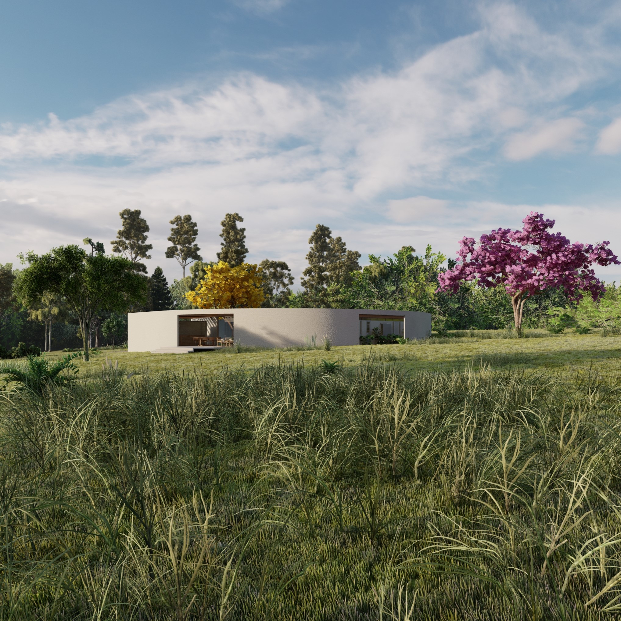
The Diorama House emerges from the delimitation of a garden amidst the vastness of the agricultural landscape of Fazenda Santa-Fé, between Campinas and Jaguariúna. The motif of the garden is the articulation of three large pre-existing trees through a white wall. The construction serves as a horizontal counterpoint to the verticality of the trunks, and its surface creates a dimensional reference for the magnitude of these trees, insignificant when scattered on the rural horizon. The curvature of the wall ensures that the sun always finds a point of tangency, creating nuanced transitions for its light and the projected shadow of the treetops.
The wall encloses an intimate garden around the yellow-flowering cotton tree, a type of kapok. In the landscape tradition, enclosed gardens (hortus conclusus) were imagined as allegories of paradise, evoking separate worlds. In the garden of the diorama house, the passage of the day is reflected in the light projected on the floor through a slit in the wall, forming a sundial, and in the movement described by the shadow of the cotton tree.
The diorama house is entirely open to its garden, which is an internal space. The membrane that separates the house and garden is very delicate, contrasting with the massiveness of the whitewashed wall surrounding the courtyard.
From the house, only the vertical succession of wooden pillars and the garden are visible. The horizontal mark that would be left by rails and guides is hidden on the ceiling and in the unevenness of the floor. Each pillar has grooves that serve as a guide for aluminum blinds to descend from the ceiling for light control.
Guillotine-type windows, operated by counterweights and protected by mosquito screens, provide adjustable ventilation on the north facade. A system of buried ducts brings air from the south facade, cooled by the earth, and is blown through the base of cabinets or low openings in the walls. In the intake of fresh air on the south facade, some aromatic shrubs, such as jasmine, will ensure that the air enters the house perfumed.
Itatiba House

In the Itatiba house project, we faced a significant slope and special conditions regarding sunlight. To make the best use of the small available plateau, the house has a narrow floor plan distributed over two levels. Access begins at the parking level and leads to the porch that marks the entrance. The social and private levels overlook the sunset behind the mountains of the Serra da Jurema. The house’s social area faces a forest to the south and offers glimpses of the region’s hills. There is a certain visual privacy that contrasts with the entrance and the pool terrace. Thermal compensation for the lightweight construction is achieved through a geothermal ventilation system that works by pressure difference. Since the main opening of the social area faces south, it almost always sees the sunny landscape. However, the sun is behind the house, and the light reflected by the sky dome has a bluish tint. The blue-toned light with the sun behind the house could give a melancholic feel. A skylight and a reflective wall above the doors bring sunlight back into the house and allow hot air to escape.
Hangar house

The hangar house is located in an aeronautical condominium, with its plot situated between a lower-level car lane and a taxiway – for airplanes – at the highest portion. Balancing the volume of the house and the hangar while ensuring architectural unity was as challenging as providing wheelchair accessibility on a site with a 7-meter slope. The need for an accessible house and the requirement for the hangar to be level with the taxiway, for aircraft maneuvering, led to a pavilion solution, single-story and oriented towards the best terrain view (northwest).
The position of the hangar in relation to the taxiway seeks the optimal level where the house establishes a more direct relationship with the sloping terrain, and where the internal communal areas intersect with the gardens that traverse the pavilion. Marking the union between the two construction stages, a garden courtyard establishes the spatial and temporal interface between the hangar and the house.
LB’s apartment
Immigrants Integration Center

Work carried out as a collaborator at the b architects office, under the coordination of Felipe Noto.
The choice of a location along the railway for the implementation of the Citizenship Integration Center and Poupatempo Immigrants was especially timely, as it allowed for the materialization of the metaphor of its main objective: welcoming. The project is built through the organization of collective use spaces: a reception courtyard (Immigrant Square) outlines the entrance for visitors and multiplies the potential uses of the Center by offering itself to the city as infrastructure for events and meetings.
The existing set of buildings, parallel to the railway as demanded by its original use, is like a group of parked and – until recently – underutilized train cars. Then, the element that transforms them into a train emerges: a continuous metal structure that develops along the 300m waterfront, capable of integrating the parts and outlining each of the many planned activities.
The first car, originally a rail control house, was converted into a reception and information space, with an area for exhibitions and a cafe, as well as support for internet access and children’s recreation. The second car is the longest: 240m of a former warehouse with an impressive recovered roof structure. Specific interventions qualify it to house the large rooms where the services of the Federal Police’s Foreigners’ Department and the new CIC Immigrants will operate, along with an auditorium and activities of the Solidarity Fund (Beauty School, Sewing School, and Artisanal Bakery). The third car – now out of alignment with the tracks, open to the street – completes the set with a temporary shelter, occupying and qualifying the four floors of a originally residential building next to the main entrance.
Sauna and outdoor kitchen in Gonçalves

The commissioned sauna and outdoor kitchen serve as a theme for enjoying beautiful portions of the land that are currently underutilized. The design language of the new constructions originated from the existing stone retaining walls in the main house, visually integrating the new uses with the house and the terrain. Green roofs and connecting stairs encourage spending time on terraces that are currently underused.
Prefab houses

Landscape
The mountainous chain of the Serra da Mantiqueira landscape bears the mark of verticality. As the region’s topography offers dramatic views of ascent or descent, horizontal constructions will integrate better with it. Architecture and nature should not compete.
We chose horizontality as a starting point, adopting a pavilion solution. Starting from the largest dimension offered by the terrain (14m), we modularized the option to 75m². The elongated arrangement of the volume allows for placement parallel to the contour lines so that the height of the ensemble and its relationship with the natural ground maintains a well-adjusted proportion. The Vila dos Mellos condominium does not foresee physical barriers between lots. Significant earth movements should also be avoided to maintain the continuity of the hillside landscape. Thus, the privacy of the residents is conditioned by the elevation difference between the building and the access points. This difference distances the domestic experience from direct contact with the ground.
To restore the relationship between the site and the house, a courtyard seemed fundamental to us: a mediation between the somewhat monumental nature and the daily life of the house. A small portion of contained landscape, internally integrated into the dwelling, will provide a sense of ownership and connection that could easily dissolve in a prefabricated house detached from the land. The balconies play a similar role to the courtyard, in the transition between internal and external spaces, between the scales of the landscape.
Access
The small courtyard will accommodate access to the building. This space reconciles various situations where the house is accessed from above, below, or at ground level: from it, the program is divided between the social and intimate areas of the house, day and night uses. The void provides greater privacy to the suite, which can be accessed independently of the social area of the house.
Construction
At the upper part of the terrain, an element will be executed that combines the functions of the foundation, a technical channel for installations, and a drainage channel for rainwater diversion. The foundation composes the first longitudinal axis of the structure. The installation channel offers flexibility for locating wet areas throughout the rear part of the building. The drainage channel prevents soil erosion below, protecting the second foundation axis. This is composed of foundation blocks that extend into concrete pillars up to the height of the foundation. There will be 6 pillars in the 75m² house and 5 in the 60m² one, always spaced in transverse axes every 2.78m. Metal beams of 6m (industrial standard) rest on the foundation and the pillar with a span of 3.6m and overhangs of 1.2m – the most economical proportion in the distribution of efforts. The volume of the house, entirely constructed with CLT panels, rests on this set of metal beams. The wood on the external faces is protected with reddish Viroc panels, in contrast to the green of the vegetation. The roof receives thermally insulated tiles that channel rainwater to the courtyard – a traditional impluvium solution – through two gutters and vertical conductors.
Thermal Comfort
When it is possible to orient the house to the North, the projection of the eaves on the balconies will ensure that the rooms only receive direct sunlight in the colder months of the year. The eave and the protection of the balconies will also work well if the house faces East, filtering the sun during the hottest hours of the day. If a specific condition requires its orientation to the West, vertical awnings can be added to the balconies to protect the interior from the setting sun. All rooms in the house enjoy cross ventilation.
Rio Acima’ SPA

The recreation block of Sítio Rio Acima is the anchoring element of the project. Its roof establishes a square at a mid-level between the existing pool, the main house, and the caretaker’s house. The proposed building would allow the removal of the existing kiosk and the proper release of the edge of the adjacent stream. The vaulted roof made of ceramic bricks echoes the annex of the main house and reinforces the sense of architectural unity in the intervention. The shadow projected by the eave onto the cylindrical volume of the bathrooms recomposes, in light, the theme of the arch that permeates the project.
The block was not constructed.
Nossa Senhora de Fátima’s fish stall
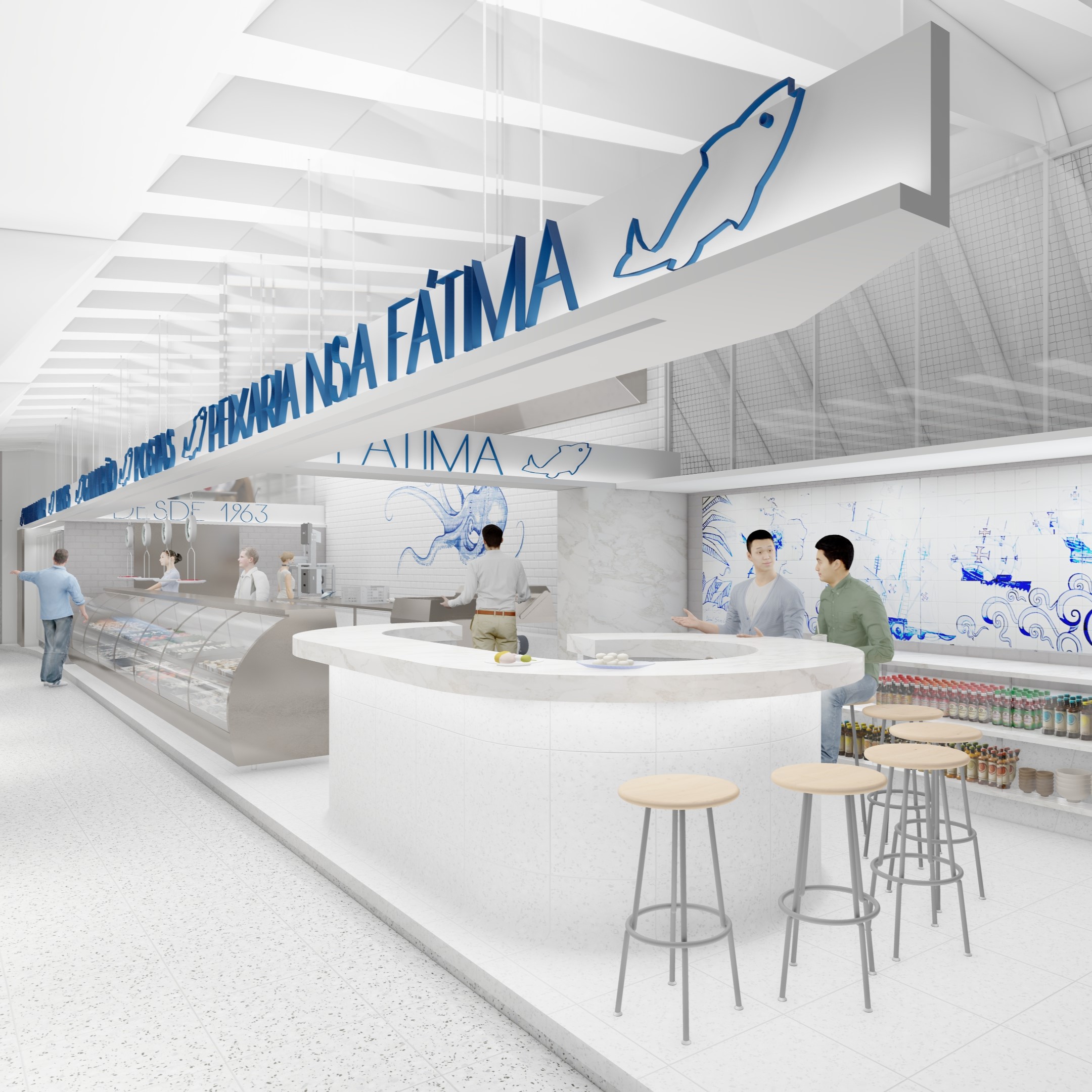
There is nothing more suggestive for the renovation of Nossa Senhora de Fátima’s fish stall than the structure of the Pinheiros market itself. The fish market should be imagined as a metonymy of the market, not as one box among many. The fish market is the entire market. I mentioned to Alexandre, my client, that in this case, the architect’s work is analogous to that of the fishmonger, a job of cleaning, of removing the superfluous. The project’s challenge is to reconcile current demands with the original power of the building conceived by Eurico Prado Lopes and Luiz Telles, a “monument in homage to Dorival Caymmi” in the words of Fabrício Corsaletti.
To restore the continuity of the market’s roof and enable the removal of the ceiling, we designed a suspended piece at half-height that houses the rolling doors, the lighting system, and the visual communication. The letters, made in metalwork, will be backlit and arranged against the white background of the suspended piece. The navy blue paint resonates with the Portuguese tiles that give identity to Nossa Senhora de Fátima’s fish stall. The position of the piece was studied to be visible in different areas of the market and so as not to obstruct the mirror that allows customers to watch the fish cleaning.
The customers of Nossa Senhora de Fátima’s fish stall are quite loyal. What the fish market actually sells, its differentiator, is freshness; so much so that it is common for customers to ask the fishmongers to open some oysters while waiting for the cleaning and packaging of their orders. To attract new customers and embrace the custom of the clientele, we envisioned the oyster bar in a strategic location, near one of the entrances and the arrival of the internal staircase of the market. The curved design of the counter in the shape of a fishhook dialogues with the original architecture of the market, as does the terrazzo covering that will be applied to the floor and the bar. Instead of traditional pebbles, the fish market’s terrazzo will be mixed with the shards of mussels and oysters served by the establishment.
Social housing in Samambaia
The proposal presented starts from the premise of constructing the maximum number of housing units allowed by the legislation applicable to the specific land. In addition to this objective, the aim was to enhance the comfort of future users. Thus, a volume with generous openings on three sides, along with corresponding sun protection elements, emerges. On one face, there are more discreet openings where the staircase is located.
The building consists of 72 housing units. The typical floor plan comprises nine units, seven of which are of the 58.82m² type, and two with a measurement of 60.20m². All units consist of two bedrooms and are adapted for universal accessibility.
The vertical mechanical circulation occupies part of the atrium facing the wet and low-permanence areas of the units. For this wet area, the possibility of hydraulic installation at any point in the unit is planned, allowing for different internal arrangements or, when accrediting families, the possibility of identifying cases where units with one or three bedrooms are needed. This adds flexibility as another characteristic of the presented proposal.
The construction method is structural masonry with a transition on the ground floor and a conventional structure from this floor to the basements, aiming to ensure the required number of parking spaces. Considering the restricted occupation of the lot, the solution of garage spaces in mid-levels was used to minimize the volume of earth cutting and related retaining walls. Finally, regarding the formal aspect, understanding it as a context with few references, a volume was sought that had in the proportion and definition of its elements a design that would qualify and give character to the territory.
The building’s configuration allows it to be implemented on the five listed lots without compromising the comfort of the residents. Areas of greater permanence (bedrooms and living room), always facing the exterior of the volume, have generous lighting in all orientations. The balcony and protection elements act as sunbreaks, preventing direct sunlight during the hottest hours of the day without compromising the low sun of the early morning and late afternoon. Another decision ensuring user thermal comfort is air circulation, occurring in two ways: on a large scale, the atrium combined with the ground floor on pilotis allows the chimney effect and the consequent escape of hot air. In the housing unit, cross ventilation is ensured with openings to the exterior and to the internal corridor.
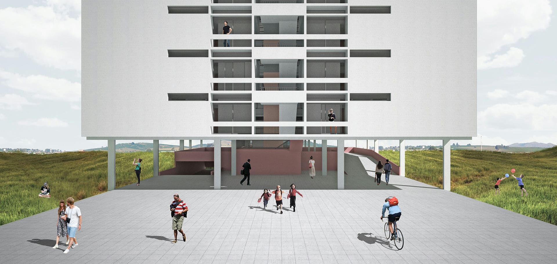
Unifesp’s student housing
Urban Insertion:
The dimensions of the plot designated for student residences are analogous to those of a typical urban block, one hundred by one hundred meters, but with only two urban fronts: Alameda Parque and Rua General Newton Estilac Leal. The positioning of the constructed volumes seeks to clearly configure these two fronts and establish an appropriate transition of scales between the local road, predominantly residential, and Alameda Parque, marked by the institutional character of the university.
Transversely situated to Avenida dos Autonomistas and near the Quintaúna CPTM station, Rua General Newton Estilac is the main access road for the complex. We aimed to adapt the sidewalks with terraces and gentle level transitions to make the everyday access, inevitably through this steep road, more comfortable.
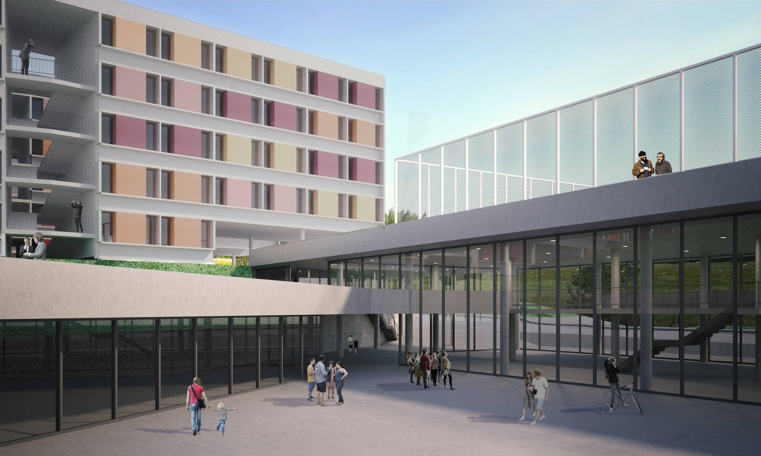
On the highest portion of the land, an access platform to the housing blocks was created. This platform extends the level of the corner with Rua Elzo Piteri, a continuity more than desired amid such a fragmented urban fabric. From this small access square, three slabs that house the bedrooms depart, arranged parallel to the street. They have a height of two floors on the high ground, a proportion that dialogues with the neighboring two-story houses. As we move down the slope, floors are added until the slabs converge into a configuration of four floors and pilotis. The horizontal extension of these buildings serves as both a scale transition, in the size of the building itself, and as a topographic index, where the slope can be palpably felt. Its height is simultaneously suitable for Rua General Newton Estilac and Alameda Parque.
When addressing the issue of the urban front on Alameda Parque, it seemed desirable to avoid overly sparse occupation, a characteristic of many campuses in the country, whose scale ends up favoring cars over pedestrians. In short, we sought to prevent Alameda from becoming a vast desolate space.
To shape the front opposite the university, we adopted a roof level that extends one hundred and twenty meters to the western boundary of the land. The choice of this level follows the same reasoning as the upper access square; it is an extension of the corner of Rua Gal. Newton Estilac with Rua Augusto Teixeira. The adoption of this platform level allows, without much effort, the difficult accommodation of a high portion of land, which, due to the Alameda Parque embankment, opposed the corner with an inconvenient four-meter incline.
The esplanade resulting from the unfolding of the sidewalks on Rua Augusto Teixeira receives the pilotis of the three housing slabs and a sports court. As it advances westward, the slope opens seven meters of clear height and allows hosting those more public programs of the complex, generating the institutional front that should qualify Alameda Parque.
A mezzanine partially divides this large space; the level of this floor coincides with the level of the corner of Rua General Newton Estilac with Alameda Parque. We decided to take advantage of the misalignment at the limits of the land to create a plateau that unfolds the corner on the mezzanine of the building.
Finally, the ground level will be a frank extension of the university’s ground. Whoever crosses under the cover formed by the esplanade finds a courtyard served by amenities such as a small auditorium, a game room, and a gym.
Housing Slabs:
The residential buildings are oriented east-west and comprise the three types of units, their variations for people with disabilities, and spaces for living, study, and laundry. The structural module of 8.40 x 7.65 meters is subdivided into four to form the smaller rooms with a free width of 1.8 m. The other rooms are multiples of this division. The family room occupies three of these modules, and to match its dimension with the cadence of the structure, four family rooms occupy 3 structural modules.
The “intermediate” collective use spaces were grouped occupying the module of 8.40 x 7.65m, and each of them comprises a living room, a study area, and a small collective laundry room. We thought it would be prudent to explode the large collective laundry room, for convenience bringing it closer to the building and other uses. We imagine that the student could leave their clothes washing and, while waiting for the washing machines, could enjoy the living or study spaces. These modules are repeated 10 times along the three buildings.
The lockers are located on the facades, allowing for a setback of 55 cm from all the carpentries, protecting them from sunlight and rain. Partition walls of the rooms extend and complement the volume of the lockers, acting as vertical brises. In addition, all units have cross ventilation and double orientation.
The building’s roof provides for rainwater harvesting and the installation of solar heating panels.
Construction Method:
The residential buildings were designed within a 90 cm modulation, and all slabs must adopt prefabricated solutions, except for a band of cast-in-place concrete that must accommodate hydraulic pipes and shafts. The foundation respects the 1.25m modulation, and its cover can be executed with reusable bucket-type forms.
In the event of a later development of the study, we intend to study the feasibility of using mixed wood and concrete slabs, which would significantly reduce the ecological footprint of the building. For now, we have adopted widely disseminated construction methods with which the local workforce is familiar.
Prefabrication can also be applied to closures that follow the proposed modulation in the plan. Without making a traditional solution unfeasible and probably more economical, the construction of all masonry and partitions in ceramic blocks in the 30cm modulation.
Apartment renovation Lausanne building
Apartment renovation in the Lausanne building designed by architect Franz Heep in 1953.
Paulista Apartment

1950s Apartment Renovation on Avenida Paulista. The main intervention involved modernizing electrical and plumbing installations, as well as redesigning the kitchen and service area. The play of colors on the walls changes the sense of depth in the rooms and mitigates the feeling of narrowness.
Vinco Shelving System

The versatility and lightness of the Vinco shelving system, a product in development since 2016, result from the research of different systems available in the international market. The dimensions were established based on a study of industrial standards of different objects.
With over 70 sets installed, supporting a wide range of uses in workshops, offices, homes, kitchens, living rooms, and showcases.
The modules can always be rearranged and allow for fine height adjustment. The pieces emerge from concise operations of cutting and bending steel sheets, which later undergo electrostatic painting.
Paulista Museum (Museu do Ipiranga)

The concept for the facade of the Monument Building takes into consideration its geographical position and its distance from the urban grid; therefore, we should think of something that could be seen from a distant perspective. We chose to use poles with spaced floodlights to achieve diffuse light, enabling the view of the entire building as a whole, resembling its daytime appearance with the elegance that the project inspired. Another reason for opting for a light source detached from the facade is to avoid deformation in the architecture caused by shadows resulting from the many recesses in the building and also to preserve the building by avoiding the installation of wires and other equipment that would need to be fixed. Our intervention is limited to the immediate surroundings of the Monument Building and does not extend to the garden or the set of fountains.
Campus of Pequeno Príncipe’s School
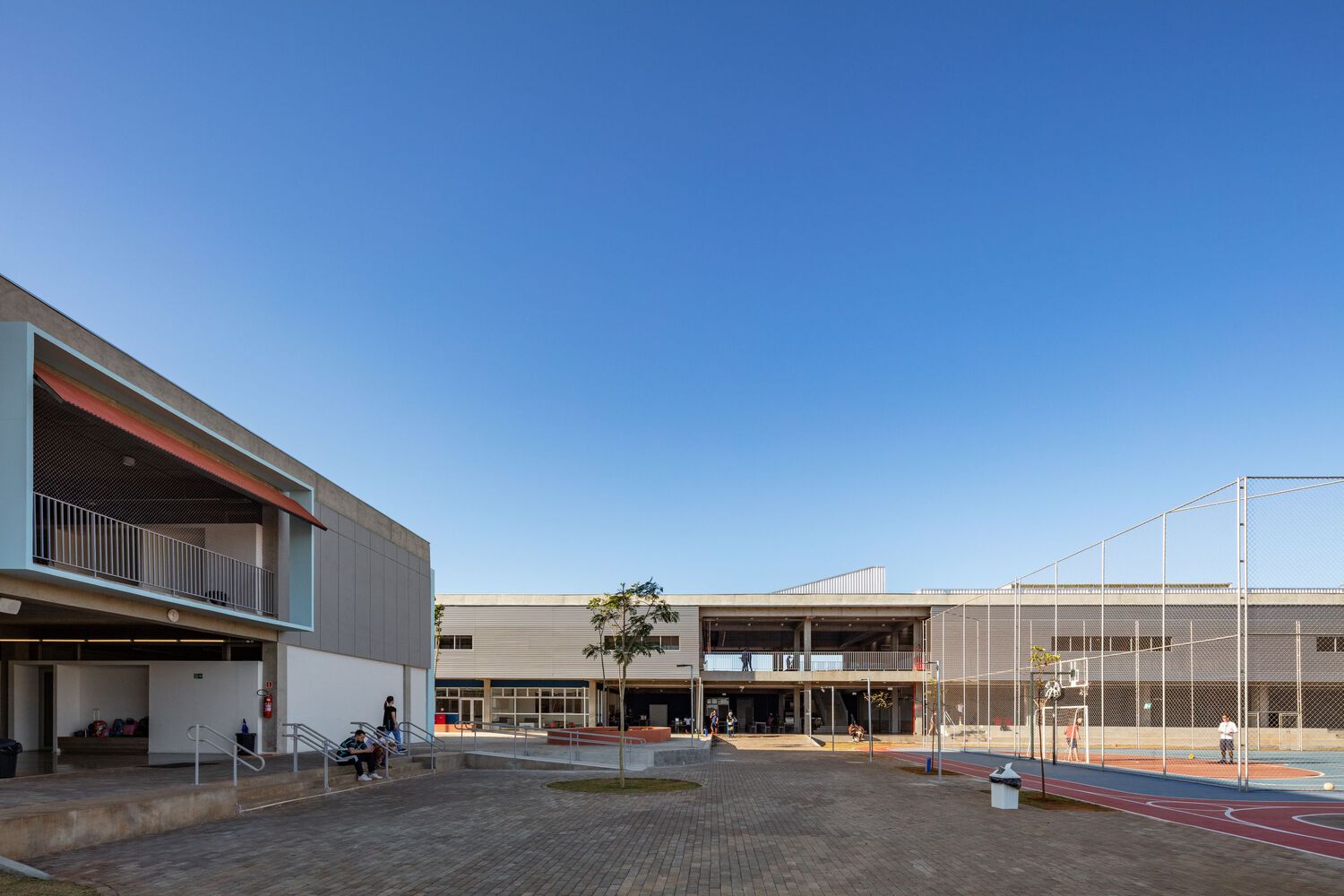
For a balanced and efficiently executed, as well as economical structure, the design approach was based on a modulation that runs throughout the entire campus, providing unity to the whole. The structure of the blocks was built with reinforced concrete, using on-site molded pillars and beams, along with precast slabs. The construction materiality is exposed, as are the electrical and plumbing installations.
Sunshades and sheds, responsible for solar protection and ventilation, respectively, are present in each block. These elements also serve as focal points of color for the campus: blue for the vertical and horizontal sunshades in steel frame, and terracotta for the inclined sunshade in perforated corrugated tile. The sheds and metal roofs have steel structures painted in green.
All lighting installations are visible and follow the project’s spirit. In this case, the character of artificial light is complementary and distinctly different from the natural light that enters the spaces through the sunshades and sheds.
Teto Casa Furniture Showroom
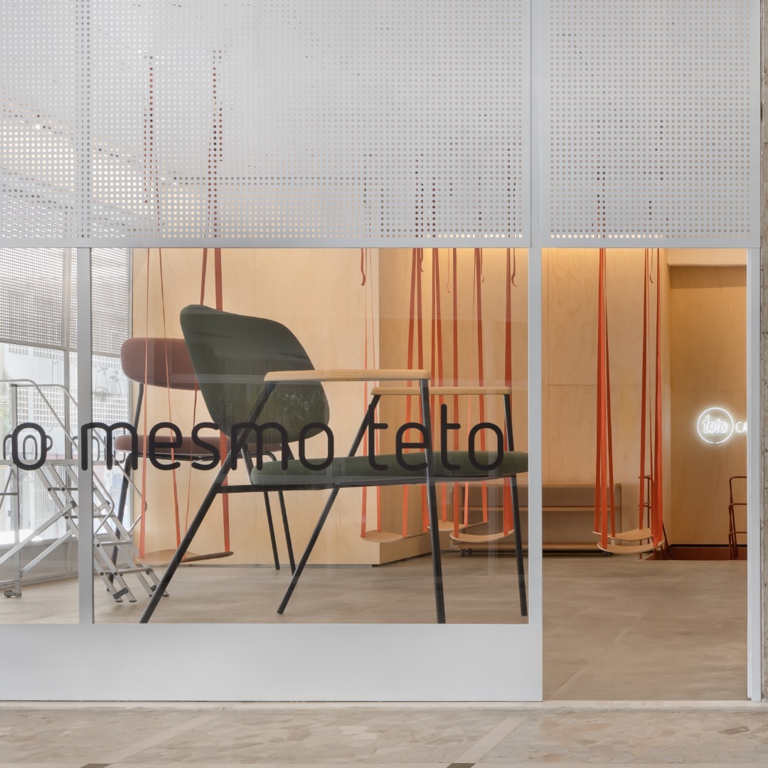
Lighting design for a furniture store in Galeria Metrópole in São Paulo.

Architecture - Teto casa team

January/2024
Forum and the Military Police Company in Guararema

Lighting design project for the interior and exterior spaces of the Forum and the Military Police Company in Guararema.
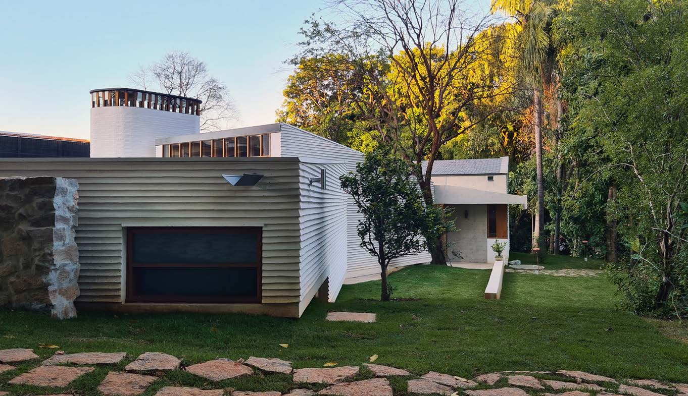
São João da Boa Vista House
Bocaína House
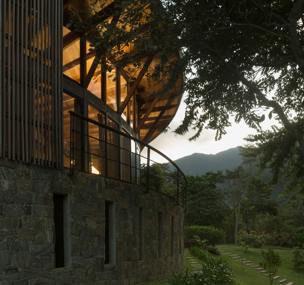
Lighting design project for a vacation home in the Serra da Bocaína.
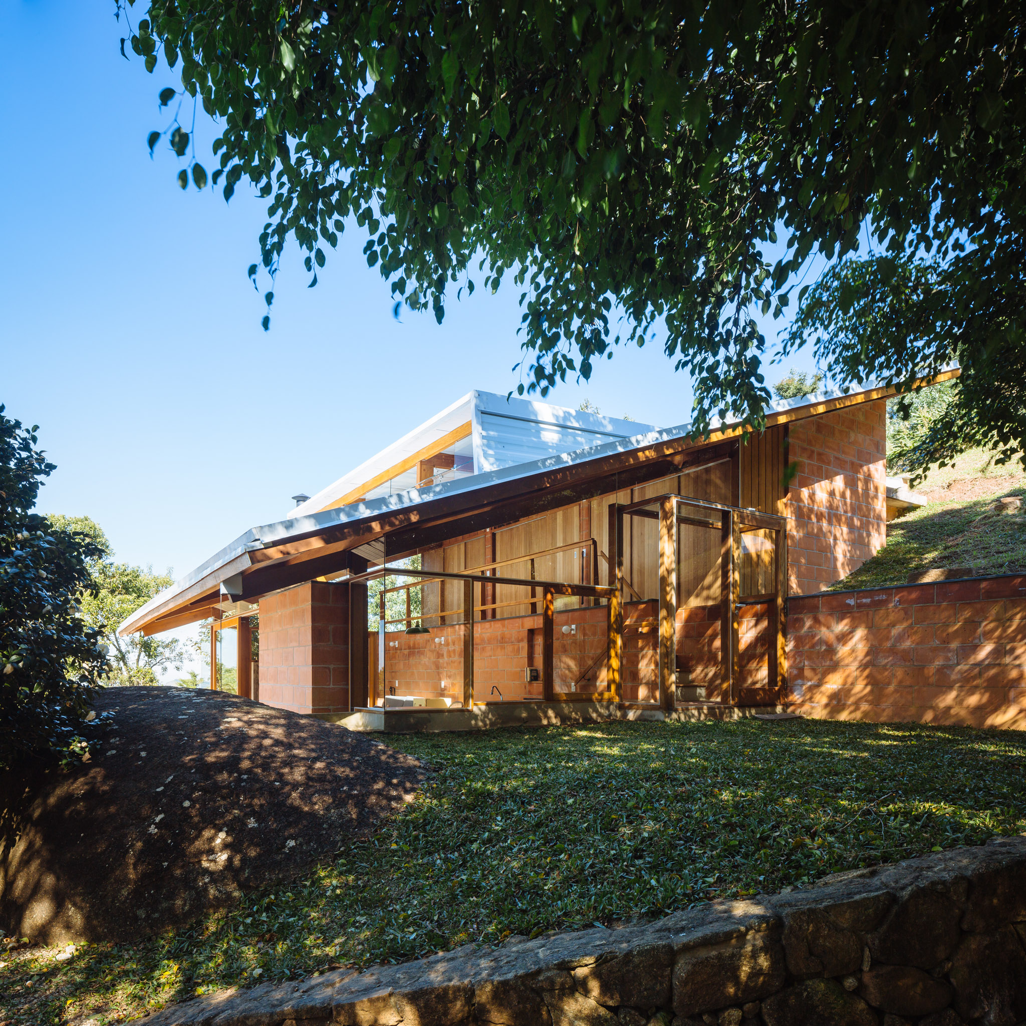
House of the Circular Terraces

The lighting design for the house of the Circular Terraces establishes a subtle line of light on the balcony that surrounds the house and a controlled level of light in the living room to avoid the prevalence of unwanted reflections. For the bedrooms and office, we produced a version of a sconce inspired by Charlotte Perriand, allowing for directional lighting. Reka fixtures were used in diverse situations: sometimes directed towards the ceiling and other times hanging above the kitchen, without losing the sense of unity. This is possible thanks to the concise design by Ricardo Heder, with whom I have had the opportunity to work on other projects.
Sesc Campo Limpo
Lighting design project for the outdoor and indoor areas of the new Sesc Campo Limpo unit.
Quitanduba Venue

Low-budget lighting project for the event space on Quitanduba Street.
Low and soft lights in the outdoor areas do not compete with the spectacle of the night sky in the Butantã neighborhood.
Greenpeace SP Headquarters
Lighting design project for the new headquarters of Greenpeace in São Paulo
Giral Company Headquarters
The proposal for the lighting of this office complex aimed not only to meet the prerequisites of comfort and efficiency but also to take advantage of the transparency of the building and its unusual triangular floor plan. The upper and intermediate floors house routine work activities, workstations, meeting tables, etc. On these floors, we sought to address all the lighting with two large fixtures—one parallel to the building’s longest façade, measuring 12 meters, and the other perpendicular to the adjacent façade. With this arrangement, the particular geometry of the floors is emphasized, and the continuity of light strips on both levels provides unity to the ensemble, indicating that the entire building is occupied by a single company. The lower floor has various uses and can be configured as an event space or a small auditorium. As the flexibility required in this situation called for general lighting without focal points, we opted for small scattered LED tubes. When lit, these tubes create a playful effect, extending the space through the angular reflections of the façade.
Note: The project was partially executed and may differ in some aspects from the specifications.
1” Sconce and Pendant Light
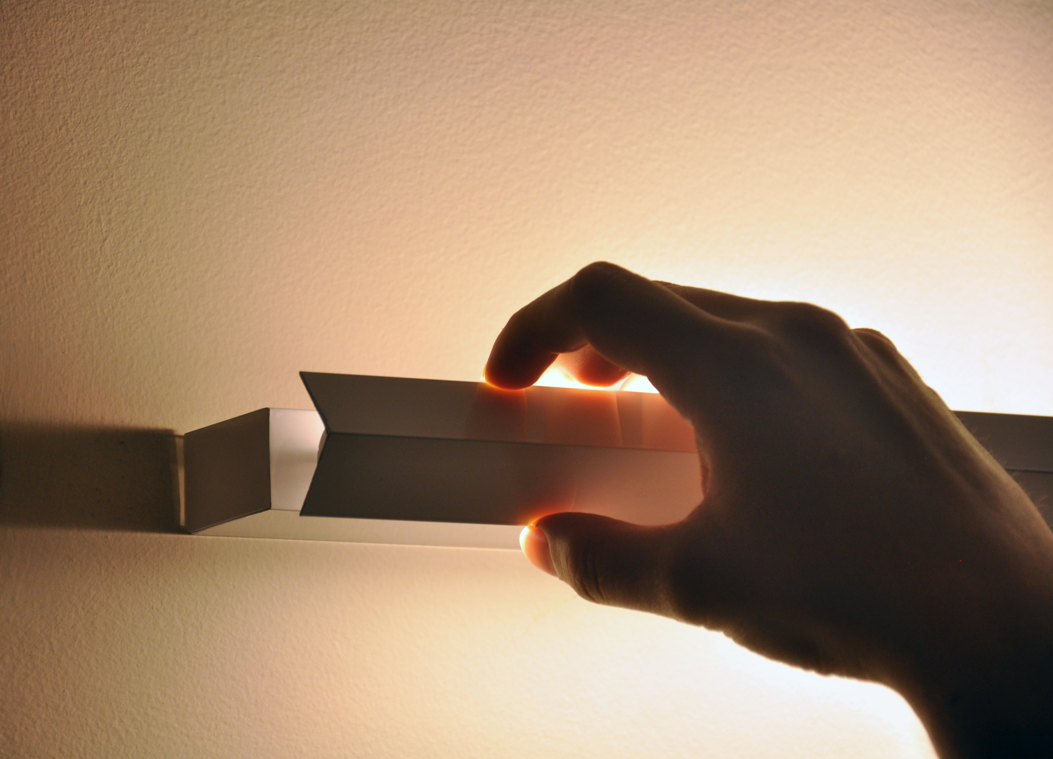
The “1” Sconce and Pendant Light” was designed through the appropriation of components produced industrially and on a large scale, typically used for other purposes.
The combination of different industrial parts required extensive research into the measurements, gauges, and diameters available in the market at a low cost. Relatively new to the market, T5-type bulbs have a diameter of only 16mm, and their reduced dimension is rarely explored in the design of luminaires that employ them. The 1″ thickness was the smallest dimension possible for the luminaire, placing the spotlight not on the object itself but on the light it emits.
The directionable light responds to the different uses demanded by users; from direct lighting, suitable for reading and work, to indirect lighting, more suitable for leisure and relaxation activities.
The adopted system is economical both in its production and energy consumption. The luminaire can be produced at a low cost without sacrificing quality.
https://www.mcb.org.br/pd/pdPeca.asp?sEdic=52&sMenu=5&sPeca=743